‘Biscuit’ bank account

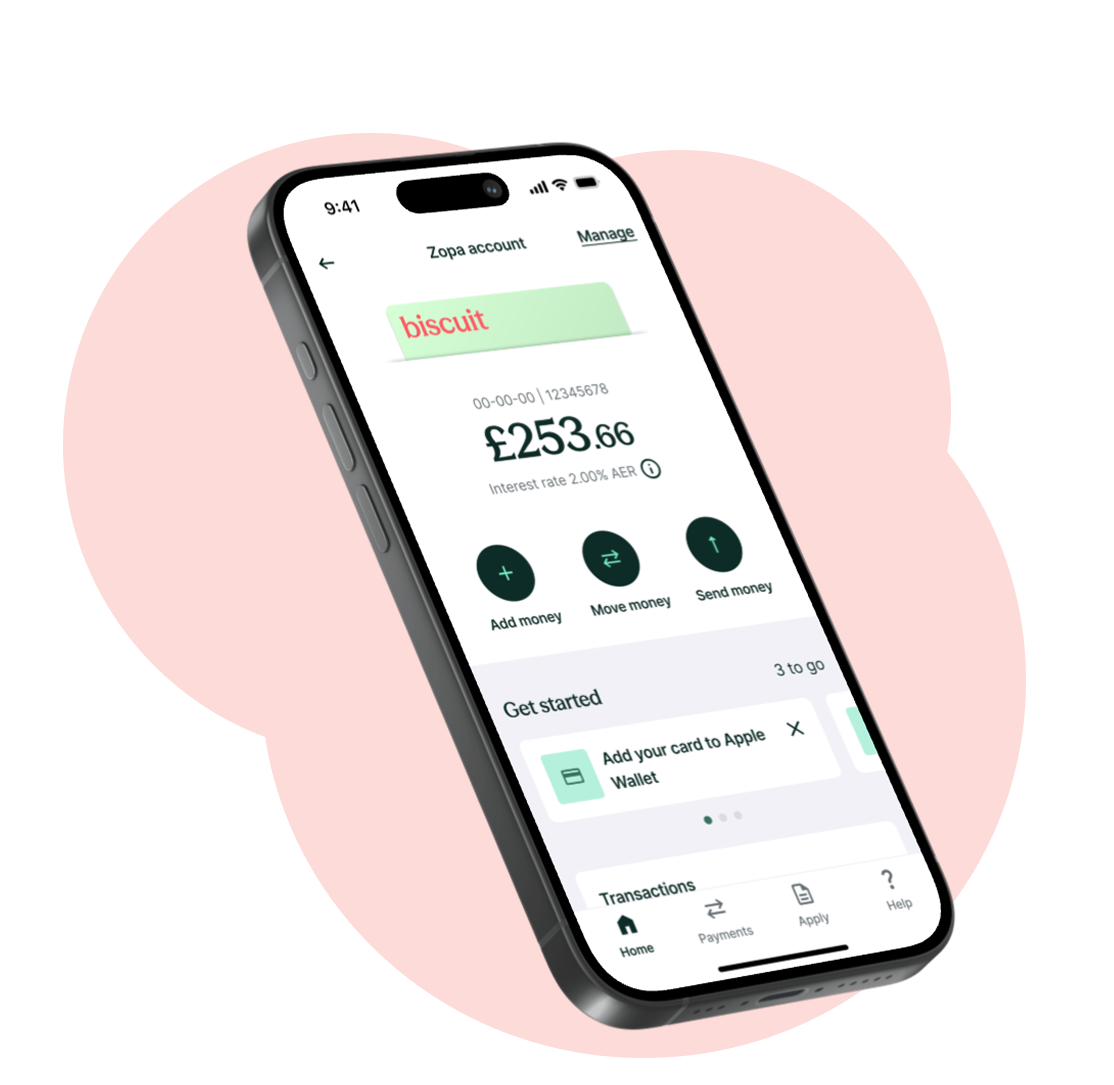
A brand new current account that had a market-leading rewards proposition and punchy brand.


I joined to project in January 2024 and owned several parts of the design. Public launch was in June 2025 and we have suppased 100k customers.


Team

80+ in the tribe, 5 squads. I was 1 of 3 designers (other designers were an LD and an SD)


My role

I owed research, testing, UI+UX in specific areas of the product


2024-25

Starting point

After starting out its banking journey as a savings and lending specialist, Zopa decided it needed to play a more central role in customers’ everyday banking. We wanted to deepen relationships and promote cross-sell.

Challenge

There are several established challenger banks with years of development ahead of us and most people are very attached to a long-term bank account. There is a lot of inertia to overcome to attract them to us.

Information architecture

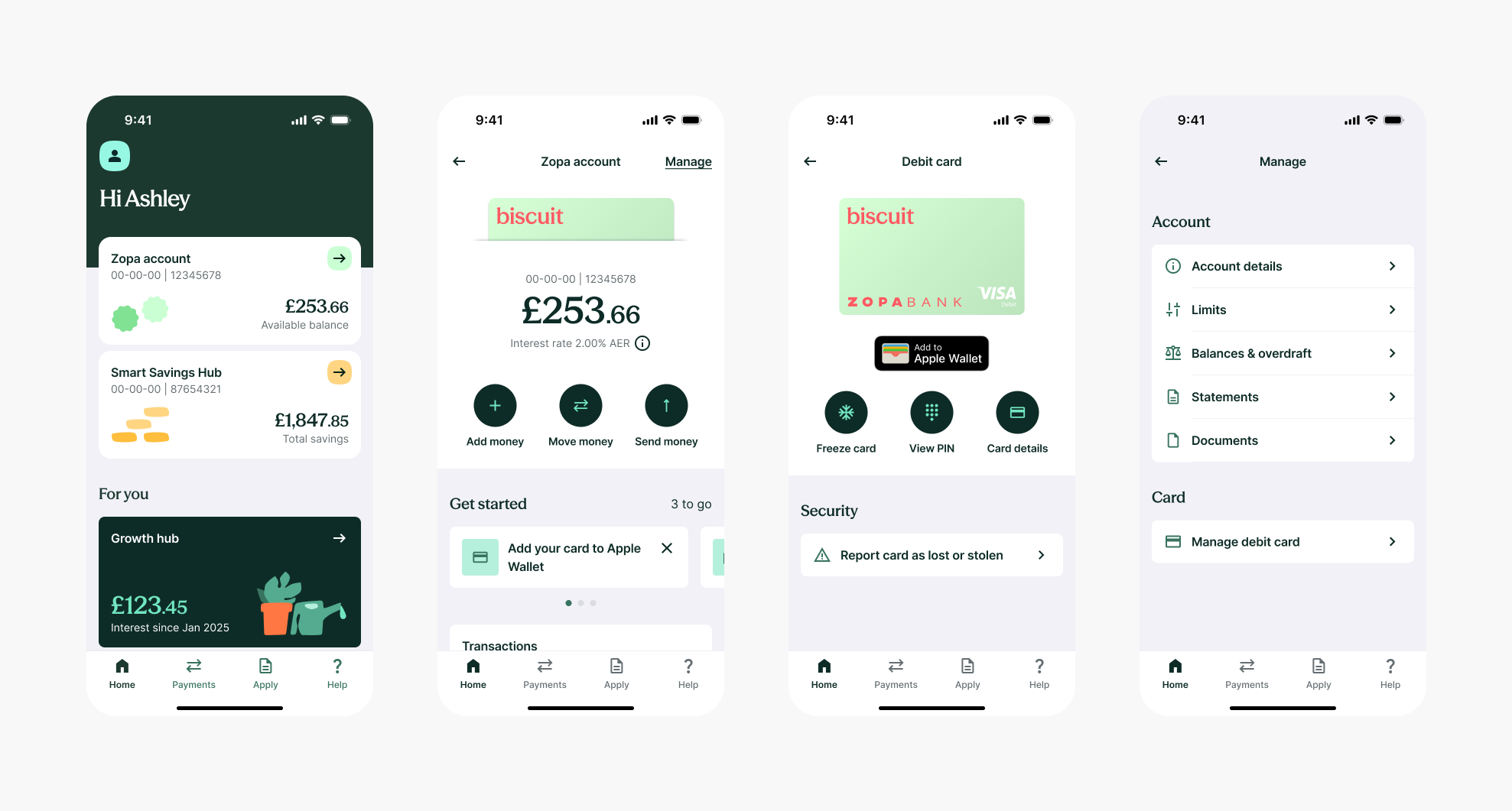
I was tasked with defining the MVP architecture.


Steps

  1. Identify all current account actions and survey target customers to gauge importance & frequency of each action
  2. Conduct competitor research to identify themes and ideas
  3. Create two wireframe variants for moderated testing
  4. Run a card sort exercise to see where customers associate certain actions

Delight

To increase retention and engagement, I identified key actions and moments where we could introduce more delight and brand presence.


Peak-end rule

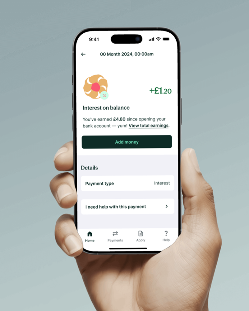
I focused on peak moments, such as when monthly interest is paid, and lifted the experience with an upbeat push notification, illustration, animation, and by offering more information to help the user appreciate the value they are achieving over time.

Statements

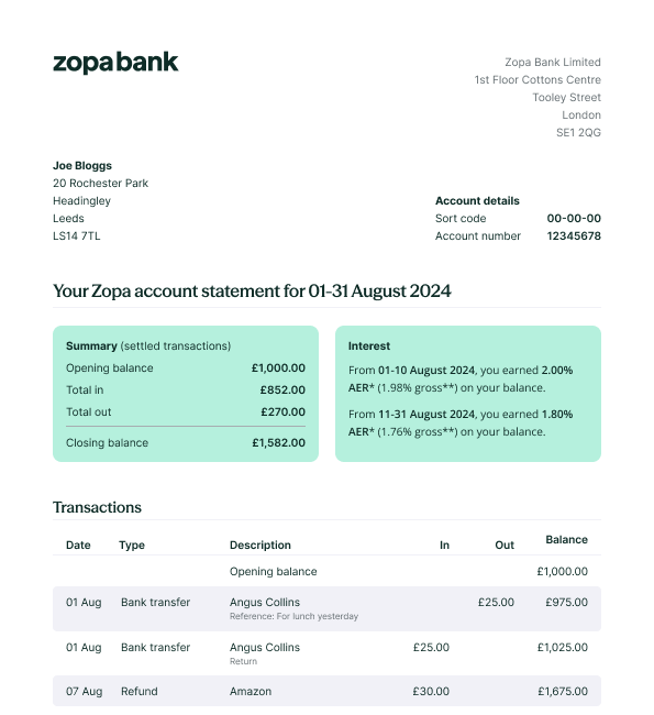
I designed the monthly, closing and annual interest statements.


My guiding principles were to include clear and digestable summaries at a glance,

Outcome & reflections

I was very proud to be part of this major product launch that took over 24 months for the company to build (I was involved for 18 months). A current account is a large and complicated product, so it was challenging to build a highly rewarding, easy to use and delightful experience capable of attracting customers away from their existing accounts.


The project’s success hinged on maintaining a fast delivery pace.. It required me to be highly organised and stay closely aligned with the roadmap. Every week was planned and optimised working closely with my PM and Engineering Manager. It sharpened by presenting skills by regularly presenting to senior PMs and Directors.


Now that we have usage data and a regular line of feedback from customers, we have an opportunity to make improvements and measure the impact. I will add this to my portfolio in due course.
Get in touch

‘Biscuit’ bank account

A brand new current account that had a market-leading rewards proposition and punchy brand. I joined to project in January 2024 and owned several of parts of the design.


Team

80+ in the tribe, 5 squads. I was 1 of 3 designers (other designers were an LD and an SD)


My role

I owed research, testing, UI+UX in specific areas of the product


2024-25

Starting point

After starting out its banking journey as a savings and lending specialist, Zopa decided it needed to play a more central role in customers’ everyday banking. We wanted to deepen relationships and promote cross-sell.

Challenge

There are several established challenger banks with years of development ahead of us and most people are very attached to a long-term bank account. There is a lot of inertia to overcome to attract them to us.

Information architecture

I was tasked with defining the MVP architecture.


Steps

  1. Identify all current account actions and survey target customers to gauge importance & frequency of each action
  2. Conduct competitor research to identify themes and ideas
  3. Create two wireframe variants for moderated testing
  4. Run a card sort exercise to see where customers associate certain actions

Delight

To increase retention and engagement, I identified key actions and moments where we could introduce more delight and brand presence.


Peak-end rule

I focused on peak moments, such as when monthly interest is paid, and lifted the experience with an upbeat push notification, illustration, animation, and by offering more information to help the user appreciate the value they are achieving over time.

Statements

I designed the monthly, closing and annual interest statements.


My guiding principles were to include clear and digestable summaries at a glance,

Outcome & reflections

I was very proud to be part of this major product launch that took over 24 months for the company to build (I was involved for 18 months). A current account is a large and complicated product, so it was challenging to build a highly rewarding, easy to use and delightful experience capable of attracting customers away from their existing accounts.


The project’s success hinged on maintaining a fast delivery pace.. It required me to be highly organised and stay closely aligned with the roadmap. Every week was planned and optimised working closely with my PM and Engineering Manager. It sharpened by presenting skills by regularly presenting to senior PMs and Directors.


Now that we have usage data and a regular line of feedback from customers, we have an opportunity to make improvements and measure the impact. I will add this to my portfolio in due course.
Get in touch

‘Biscuit’ bank account

A brand new current account that had a market-leading rewards proposition and punchy brand. I joined to project in January 2024 and owned several parts of the design.


Public launch was in June 2025 and we have surpassed 100k customers.


Team

80+ in the tribe, 5 squads. I was 1 of 3 designers (other designers were an LD and an SD)


My role

I owned research, testing, UI+UX in specific areas of the product.


2024-25

Starting point

After starting out its banking journey as a savings and lending specialist, Zopa decided it needed to play a more central role in customers’ everyday banking. We wanted to deepen relationships and promote cross-sell.

Challenge

There are several established challenger banks with years of development ahead of us and most people are very attached to a long-term bank account. There is a lot of inertia to overcome to attract them to us.

Information architecture

I was tasked with defining the MVP architecture.


Steps

  1. Identify all current account actions and survey target customers to gauge importance & frequency of each action
  2. Conduct competitor research to identify themes and ideas
  3. Create two wireframe variants for moderated testing
  4. Run a card sort exercise to see where customers associate certain actions

Delight

To increase retention and engagement, I identified key actions and moments where we could introduce more delight and brand presence.


Peak-end rule

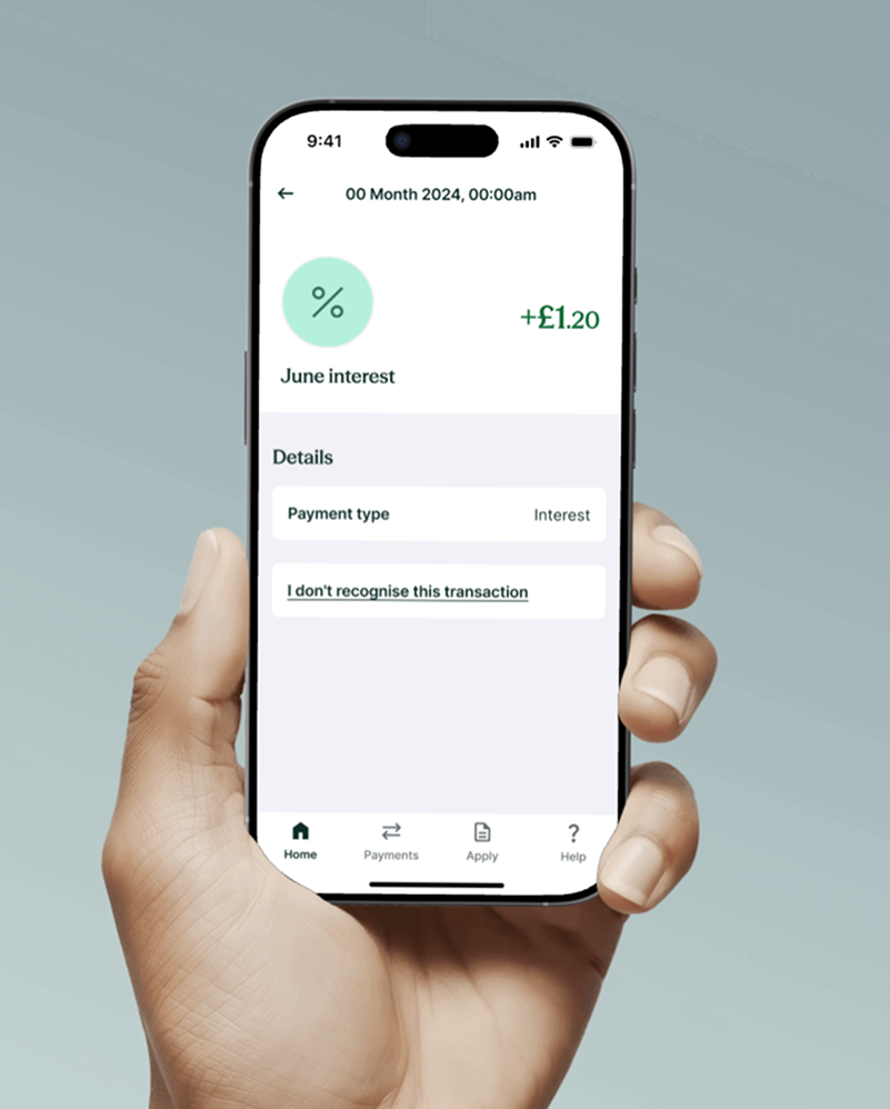
I focused on peak moments, such as when monthly interest is paid, and lifted the experience with an upbeat push notification, illustration, animation, and by offering more information to help the user appreciate the value they are achieving over time.

Statements

I designed the monthly, closing and annual interest statements.


My guiding principles were to include clear and digestible summaries at a glance, and be highly accessible with purposeful use of colour and spacing.

Outcome & reflections

I was very proud to be part of this major product launch that took over 24 months for the company to build (I was involved for 18 months). A current account is a large and complicated product, so it was challenging to build a highly rewarding, easy to use and delightful experience capable of attracting customers away from their existing accounts.


The project’s success hinged on maintaining a fast delivery pace.. It required me to be highly organised and stay closely aligned with the roadmap. Every week was planned and optimised working closely with my PM and Engineering Manager. It sharpened by presenting skills by regularly presenting to senior PMs and Directors.


Now that we have usage data and a regular line of feedback from customers, we have an opportunity to make improvements and measure the impact. I will add this to my portfolio in due course.